Pearl Header Builder Features
PreviousHow to add YouTube/Vimeo videos to websiteNextHow to translate or change the strings of the theme and plugins?
Last updated
Was this helpful?
Last updated
Was this helpful?
This manual describes the features and settings of the - .
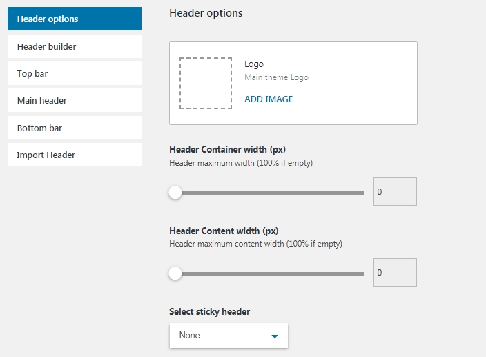
This section contains options for setting a logo, width of the header container and content, and a feature for selecting a sticky part of the header (Top, Main, Bottom).
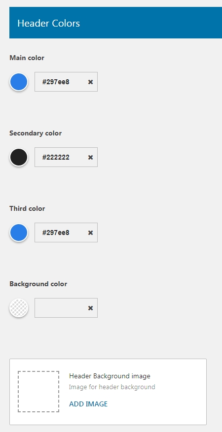
In this section, you can set the default colors of the header. Those colors are for texts, links, and background. Also, you upload a background image to the header.
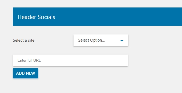
You can add links to all the needed social networks and display them by using a Socials item.
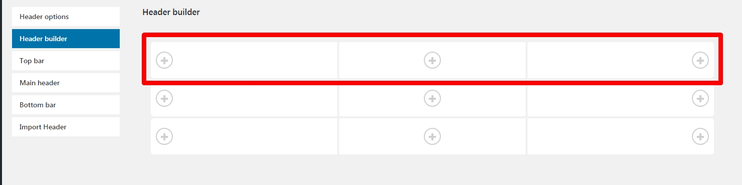
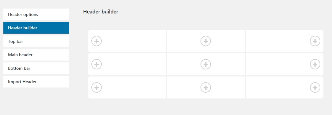
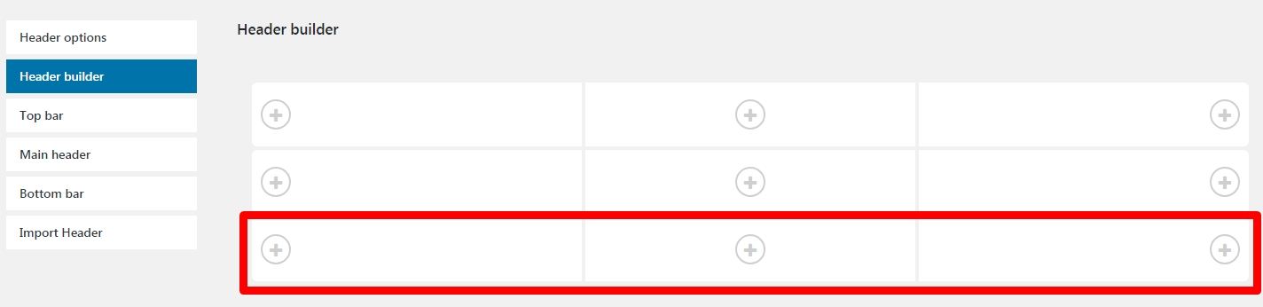
This is the main section of the plugin where you need to add header elements. It divides to the three parts - Top, Main, Bottom respectively.
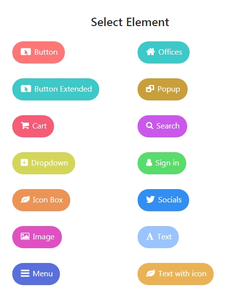
Plus icon buttons open a window with header elements and you need to select the needed elements.
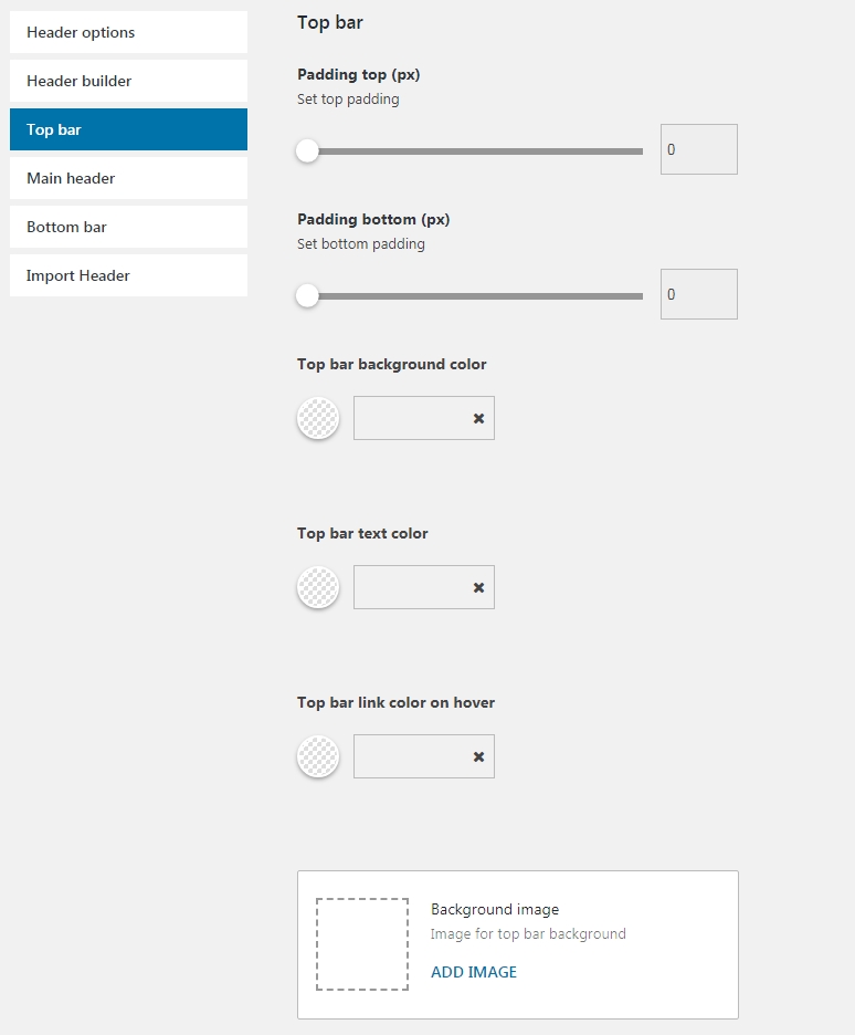
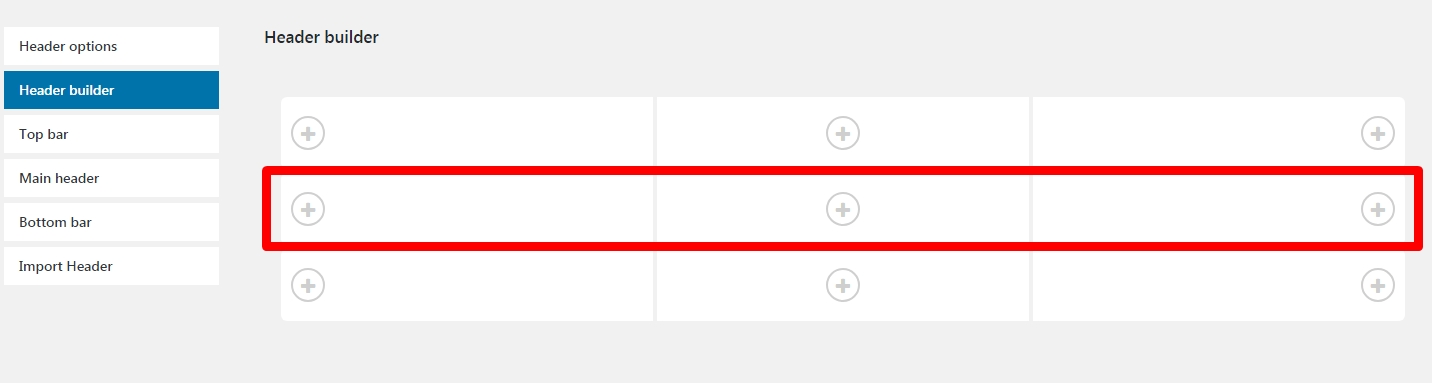
The Top Bar contains default settings of a top part of the Header Builder. The Top Bar, Main Header, and Bottom Bar sections consist of similar options for changing padding values, background and text colors as well as the background image.
You can set up a middle part of the Header Builder plugin in the Main Header section.
In this section, you are able to set up a bottom part of your header.
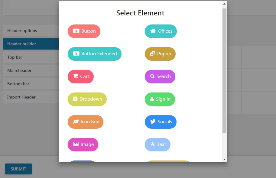
Here is a list of all the available elements:
Button - button with custom link and label
Extended Button - button with a different style and additional option
Cart - WooCoomerce cart icon with a counter.
Dropdown - displays a dropdown list of custom links and language switcher
Icon Box - a box with a title, description text, and icon
Image - element for displaying a site logo as well as custom images
Menu - displays the website menu from the Appearance -> Menus section of the WordPress
Office - includes a dropdown list with different content.
Popup - button with a popup window which displays the selected page content
Search - search bar with different styles
Sign In - WooCommerce login/register links
Socials - social network icons
Text - element for displaying a simple text
Text with Icon - text block with icon selection option
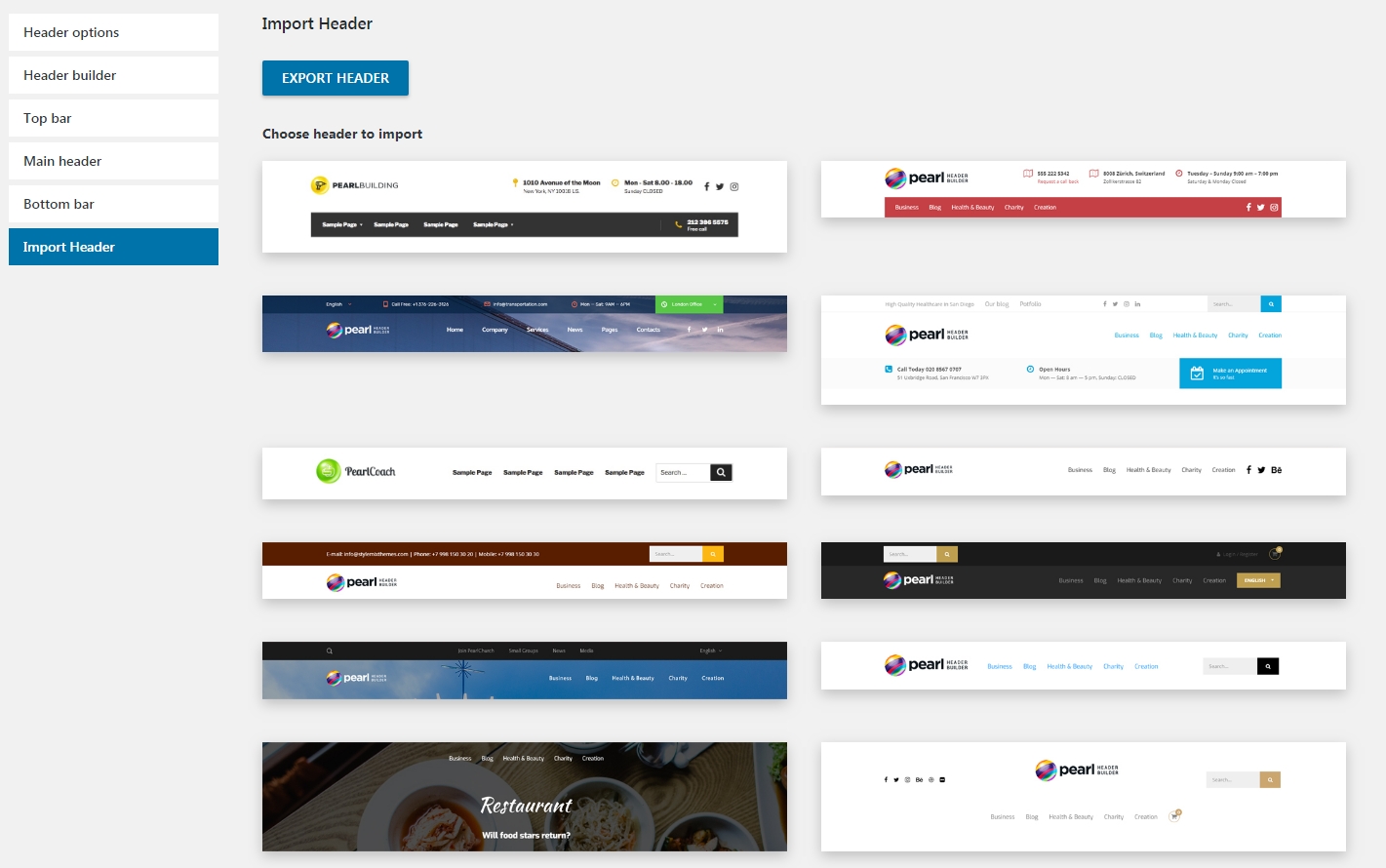
There are 12 header templates in this section and you are able to import these templates. They contain different prebuilt header structures.
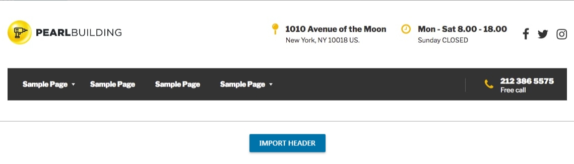
In order to import a header template, you need to click on the template image and Import Header button. The page will be refreshed after the importing process is done.
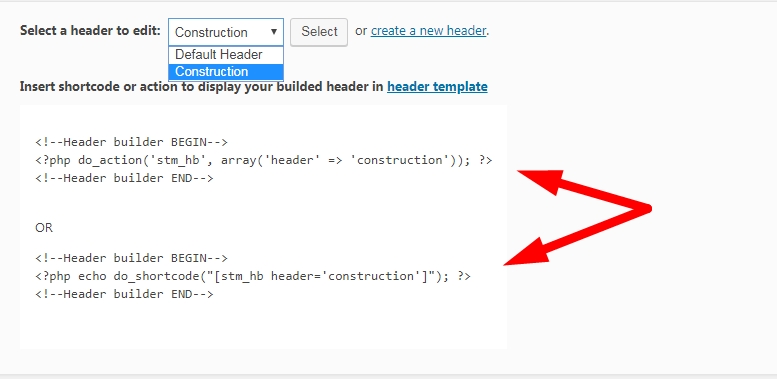
The white boxed area displays a shortcode or action of the header template. You can select the imported header and copy one of these codes.
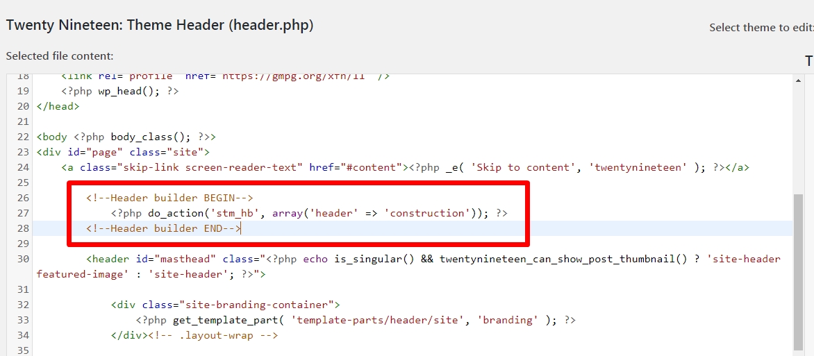
The copied code should be inserted into the header.php file of your theme.